9 Social Media Graphic Design Secrets (from REAL graphic designers)
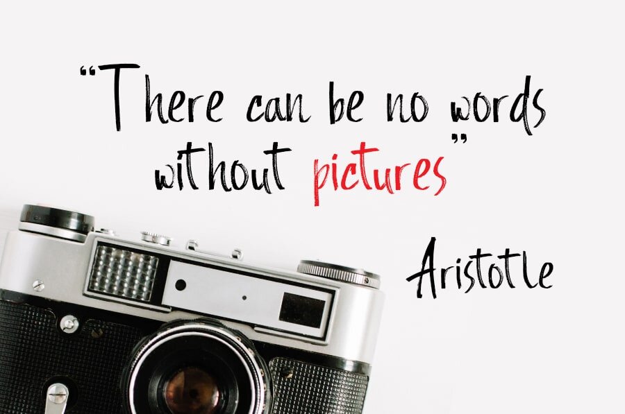
We’re visual beings, and we’re drawn to visual content online in more ways than before. After all, 90% of information our brain processes is visual.
As social media shifts to visual social media, the opportunity for businesses to get their graphic designs for social media right is huge.
And that’s where we come in. In this post, we’ll share with you 9 social media graphic design secrets, direct from our team of graphic designers.
1. Show them instead of telling them
Anything visual will almost always beat a bunch of text. Images, videos, graphics, slideshows, GIFs; basically anything that helps catch the eye of the fast-scrolling social media user.
Make sure to present the right images to the right people. That also includes the way you sell what you’re selling.
If it’s a product with high visual appeal, say furniture and homewares, use the product image itself to share your message.

But when it comes to selling services or intangible items, such as vacations and trips, it’s best to excite the senses and imagination. “Sip ice-cold Mai Tais on the beaches of the South Pacific while crunching sand between your toes,” gets the point across nicely.
In either case, the text must supplement the image and not the other way around.
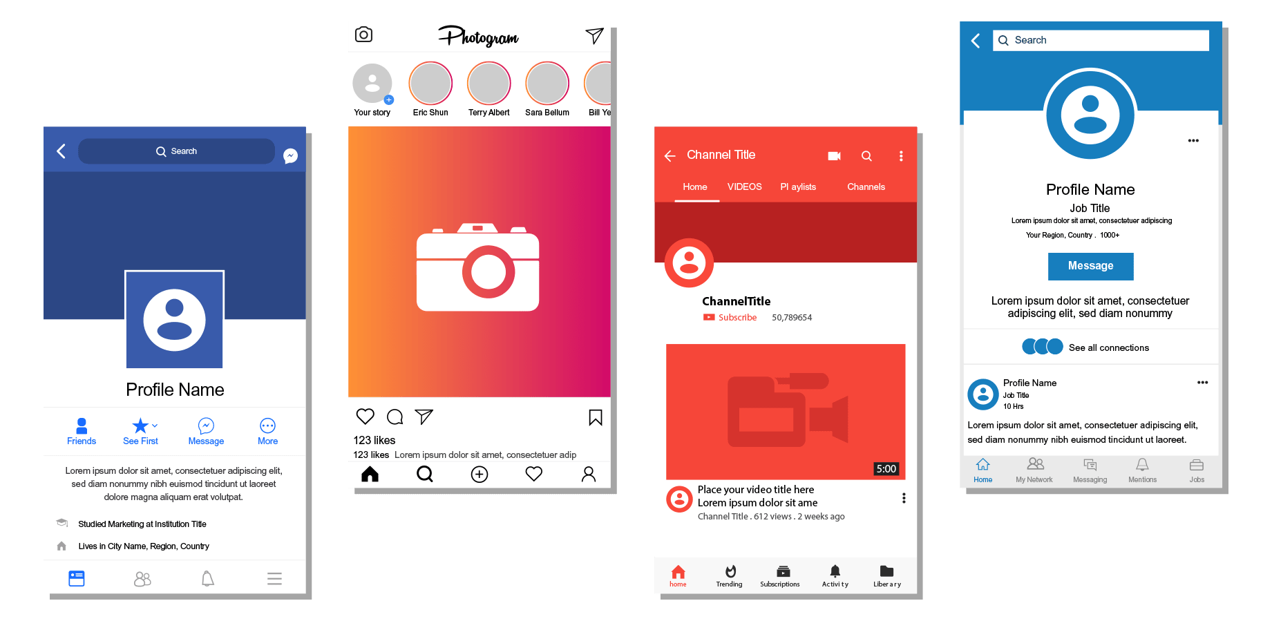
2. Sizing them right
Unlike other visuals, a graphic design for social media should always be sized precisely for the platform and place that it’s meant to be used for.
Most images on social media need to comply with the official dimensions if you really them to pop and display correctly.
The optimal for a Facebook post is different from Instagram. Further, a Facebook post will require a different size to a Facebook cover.
Then to add a final layer of complexity, the optimal size for social media image dimensions changes frequently, and often without any notice (ahem, Facebook) so it’s also best to check into an updated guide before starting the design.
3. Images should pop
Vibrant, colorful images attract lots of eyes, so choose unique imagery that has bright, eye-catching colors. Alternatively, a design with high contrast will help attract the eye as well.
If you’re selling food or most general products, be sure that the greens, yellows, oranges, and reds in your images as they generally pop more than black, blues, and greys.
Don’t forget to take the season or event into account when choosing colors either. This Christmas promo graphic design for social media from LOFT is instantly reliable to Christmas but not in an overly cheesy way.

If you’re selling a service, a well-chosen stock image or vector will also work well. Spotify does this consistently well but pairing fairly generic stock images with a simple message.

*Read the full blog here.